Monday, May 2, 2011

Sanders, Schiavo, Gibly Video Project

Untitled from Haley Sanders on Vimeo.

>


"Sophie's Bucket List"

We chose to create a satirical video on what may happen if a girl like Sophie gets bullied. It is meant purely for the aspect of comedy and entertainment, while based on a loose plot; Sophie is bullied, and as a result she creates a bucket list. She finds justification for her actions and as she continues on her journey, the plot thickens. The point of our video is to exploit the cyclical processes of ill-intentions in our world in an exaggerated, comedic manner. A message is revealed in the end with a full-cycle plot. Watch the video to see what happens; enjoy the show!


Our video is a jab at the taboo of having inanimate objects as one's significant other, as well as the materialistic society we live in today.

Klandrud, Evans, and Bouck Video Project


For our video we wanted to do the old Don Quixote story with a contemporary twist. The main character in our video gets knocked out and thinks he is in the game World of Warcraft. The video came out rather well in our opinion and we are proud of the camera angles and whatnot. The only issue we had was with the sound and dialogue. There were times when the background noise was too loud and the lines were hard to hear. Obviously, it could've been fixed with a mic of some sort but we didn't have that type of technology available to us. Overall, we are happy with the way it turned out.

Heather Albjerg Ashley Bennett Lindsey Scofield


We wanted our film to have a simple storyline that was relatable, so we chose to do our short film on a high school relationship. We wanted the dialogue to seem natural and for our characters to be believable, so we gave them a very loose script to follow in our mock/implied interview.

Fahnestock, Wicklund, Morrissette Video Project

The name of this video is The Bomb Squad. It follows a special operations team through a mission. Unfortunately for them, they're mission coordinator is not very focused.

Monday, April 18, 2011

Abracadabra


For this project I chose to do an animation about a magician, because I liked the fact that I can connect the pictures in a different sequence than reality, which allowed me to do some magic tricks. I photographed about 800 pictures, and ended with about 500 photographs that I connected together.
To fit the sound was the hard part. I chose two background songs that correspond with the atmosphere I wanted to create. Than I added few different tracks of real object's sounds to fit the actions of the man in the movie.

Alex Suarez

Ashley Bennett

For my animation, I wanted to capture the confusion, randomness and playfulness that kids experience as a result of their imagination. Done using a whiteboard and Photoshop.

Matt Picon

For this project I decided to explore the use of bizarre and unconventional ideas in making a "drawing-like" animation. I used actual patents of inventions, and wanted to present how they worked. It wasn't necessary to make the entire drawing move but to focus the motion on certain aspects within each invention that made them unique. Sound was added, originally just having the soundtrack which gave it a silent film feel. Eventually sound effects were used to add to the overall ambiance, not to give literal sounds to each device but more of a satirical representation of these unrealistic inventions.

Wednesday, April 13, 2011


So for this project I decided to demonstrate animation, via paper with a desk background. This was extremely frustrating, seeing how if I breathed deeply or sneezed, every piece of the setting and character would fly off. Other than that, the setting and the music was deeply influenced by Charlie Brown Christmas, and decided to get a bit cartoonish with the sound effects.

Brandon Beren

Used modeling clay. This is part 1 of the whole thing. I didn't have the time to shoot the entire planned animation. The Song is Inside Every Bird by Mark Growden.

Evans Bouck Animation Project


For our project we chose to do a suicide backwards. Ryan took pictures of me (Alyssa) while I pretended to commit suicide. We worked together in Audacity, Final Cut Pro, and Photoshop to create the final product. We chose On the Nature of Daylight as a background song because we thought it would enhance the emotions of the video. We also added other sound effects that went with the actions in the video.

Haleigh Klandrud Animation Project


My project is titled "Dream Away" because it is about a girl imagining herself as different characters and the different places she would be.  I got the idea for this animation from the Amazon Kindle commercials. I used the stop-motion technique of pixilation and had my actress lay on the ground with sheets as backgrounds, while the camera was set up above her taking the pictures. I used cut outs and toys as the other props. I added a song that lasted for the whole video because it was the song that originally gave me the idea for the animation. (Also, the song is titled Dream Away, thus the title for the animation) The other sound effects I added were for the specific things that happen during the animation like the flapping of the bat's wings, the ocean sounds, bubbles coming from the fish's mouth, the magic wand, etc. I kept the title and "The End" as part of the animation because I thought it kept with the "cuteness" of the piece. 

Monday, March 7, 2011

Ben Sheets Vector Project

I chose to recreate a book called Left Brain, Right Brain by Sally Springer and Georg Deutsch. From prior knowledge I tried to portray my idea of what the difference between the two are. The left brain is the more organizational, mathematical side of the brain while the right brain is artistic and spontaneous.

Alyssa Bouck Vector Project

I chose the book Th1rteen R3asons Why for my project because I felt like I could get the most out of making a cover. I chose a cassette tape because the book is about a girl who commits suicide, but makes a tape beforehand giving the 13 reasons why, including 13 different people. I chose to outline the text in red because I was thinking of the suicide.

Ryan Evans Vector Project


I made a cover for the book Pseudo City by D. Harlon Wilson. I chose this book because it is one of my favorite books of all time. For the figure in the cover I made him intentionally flat and minimalistic using the pen tool. I found the background for the figure and chose to keep the rest of the cover simple with black text on grey.

Heart of Darkness


Heart of Darkness by Joseph Conrad.

This is a book I enjoyed reading a few years back. It takes place in the Congo and explores the hypocrisy of imperialism, madness as a result of imperialism, and the absurdity of evil. The main character ventures up a river in the Congo to meet with Kurtz, the man on the cover, who was dressed in an all white suit in the middle of the Congo.

Sunday, March 6, 2011

Jim J vector project


I chose the book Catch 22 by Joseph Heller as my project. The book was written in 1970 and involves a man who wants to be declared mentally unfit. To do so he must ask for a mental evaluation. Asking for a mental evaluation is seen as a rational thing to do, therefor anyone who asks is obviously of a stable mind. Heller and his publicist came up with a list of names for this condition and settled on "Catch 22" as it sounded the best phonetically and has since become synonymous with paradox. I chose to make the cover look as if it were an important, though coffee stained, official document with most of the text censored. True to form, the more I worked on making it simple, the harder it got. My own "Catch 22".

Brandi Blanco Vector Project


For this project I choose to do the very hilarious book "5 Very Good Reasons to Punch a Dolphin in the Mouth" by the Oatmeal. The design is pretty basic with simple colors, everything but the text, and stars was made with the pencil and brush tool.

Saturday, March 5, 2011

Haleigh Klandrud Vector Project

This book isn't actually published, it happens to be a novel my older sister wrote and is currently working on editing/getting it published and I thought it would be fun to make a cover for it. The twisted rabbit ears are part of some of the characters in the book, and the overall look of the book cover is rather dark because the theme of the book itself is dark. The letters of "darkness" descend and fade away to show the movement of going down, since these twisted rabbit eared creatures live underground, and the main characters spend the majority of the book underground as well. I tried to make a "scary" book cover, but realized it was a lot harder than I had originally thought it would be so I ended up with this. 

Wednesday, March 2, 2011

Haylee Schiavo


The Road, by Cormac McCarthy. For my project I wanted to achieve two things: simplicity juxtaposed with complexity. The design is simple, with silhouettes of a gun and two people. The color scheme is simple, but I think it is successful in the aesthetic appeal. The complexity is found in the meaning behind the imagery of the book cover. For example, the gun is a major symbol in the novel. It not only suggests murder and chaos, but it reaches a further meaning that is presented more so towards the end of the novel. The man and the son are the two main characters. They also represent a more important concept that is suggested in the novel that questions at what point it life lacks its purpose. In general each of the symbols on the cover represents this deeper meaning, and the color scheme represents the chaos in the novel in contrast with the simplicity of emotions that are arisen. The novel is simple and yet it is complex, just like the book cover. I did my best in presenting this message. Also, the lines, to create the road, lead your eye to the title, which gives the sense of an obstacle in which the two figures on the bottom are going to face in the novel. That is the main message I wanted to achieve.

Sanders Vector Project

I chose one of my favorite books, The Sweet Far Thing by Libba Bray. All of the images on this leather diary cover are representative of events in the book. I chose them for this reason as well as their aesthetic effectiveness. I converted a raster picture of a tree to vector, and edited the outlines and shapes of it. I made the background out of a leather book cover raster image, and chose a font with serif that had had the same sort of "feeling" in its lines as the tree.

Matt Picon Vector Project


I chose the book "Survivor" by Chuck Palahniuk. There are very apparent religious connotations within this novel and while most of the story is told as a memory, the setting is on a falling plane. In this design I wanted to incorporate both of these elements into my book cover, which took 3 separate images to create. I am attracted towards negative space and simple designs on books, which explains my black and white colors and stencil quality I used with the image. Several different fonts were used to create the text which I wanted to keep rigid and formal, contrasting the simple dynamic of the image.

Jared Wicklund


For this project I was trying to make a very simple type of book cover, similar to the ones show before. Very much like the original book cover, it has a very simple design, but conveys the point of it being very like a "how to" book. For this, I used the tracing tool, and it took some difficulty changing the color for one of the symbols to appear zombie-like.

Matt Fahnestock Vector Project


This is a cover for the book 1984 by George Orwell. I wanted to convey the feeling of always being watched, which the main character always feels.

Monday, February 28, 2011

Self Portrait


For this attempt I chose a single image of me holding a light source. I added different brush strokes to the light to make it look stronger and more dispersing, and so it will cover most of my hands. 
The background I did with few different filters, color layers and blending modes, which I experiment with until I got to a pleasing result. This result consist of broken diagonal lines that add tension to the composition, and lighter values in the center of the frame to bring the focus to the figure. 

Wednesday, February 23, 2011

Jim J


I found this project difficult at first. I was dead set on taking the letters from a given word and working an image that relayed the meaning of that word. Inspired by the abstract art that we covered I was able to just let go and work with letters as shapes and think outside the box. I wanted to relay something organic through the use of hard lines and colors.

Brandi Blanco

My main focus for this exercise was creating an image with both balance and movement. I used complementary colors, and repeating shapes and lines to accomplish this. I incorporated B's, O's and L's, for no particular reason besides the movement that each letter exemplifies. I wasn't concerned for making the image perfectly smooth and clean so please forgive some lines that may have imperfections or any incorrect spacing.

Monday, February 21, 2011

Brandon Beren


This is all x's and o's. Just messed with things I guess.

Haleigh Klandrud Vector Exercise

With this exercise I wanted the symbols to lead the viewer in certain directions as well as play with very curvy lines next to very sharp, rectilinear lines. I also wanted to have a very large, bold feeling with the piece.

Ashley Bennett


I chose the world "cold" for this image because not only did it have a nice mix of curved and straight lines, but the word also has a lot of sensations, colors, images, etc. associated with it. For my vector image I wanted to focus on thawing or melting and therefore tried to create a dripping sensation with the letters.

Sheets_Vectorexercise

I wanted my image to have a digital feel to the background so I used very boxy font. After seeing the background I thought I'd put a more modern feel in the foreground so the interpreter could easily see the differences in positive and negative space. I chose to use two opposite colors and then decided to blend them to give the image more flow.

Matt Fahnestock Vector Exercise


I decided to use a sunset as my inspiration when making this image. All of the shapes are made up of the words "Oohh" and "Aahh", because I associated those words with a pretty sunset.

Friday, February 18, 2011

Ben Sheets Rater Proj

I chose to create an image that led you into unknown space. By having a bridge with no ending and keeping a lot of the blue sky in focus. These pictures were taken over about a week span which gives the buildings many different shades according to the time of day. I'm interested in traveling with no destination. Traveling just to travel, just for the adventure and I think I portrayed this through the raster project well.

Monday, February 14, 2011

Eatting Rabbit


After trying many different science for this project, my rabbit collage seemed the most successful.
I liked the red color of the couch in contrast to the white fur of the rabbit and the green kale she is eating.
I also liked the scale of the small rabbit in contrast to the big couch, which emphasize the rabbit and draw the viewer attention to the detail in the image.

To do this photomontage I tried to use David Hockney technique, of adding many photographs from the same perspective together to create a bigger pictures and to tell a larger story. The rabbit is seen as eating a kale pice, but also the unusual location and the atmosphere is depicted, which adds to the mystery

Brandi Blanco

For my project I decided to focus on time in relation to the painting process. Because a piece of artwork goes through many stages, (the primary sketch, inking, first coat of paint, second coat of paint, etc.) I was really curious to see what it would look like if you combined all of these stages into one, and here it is.

Haylee Schiavo final project

In attempt to capture the idea of time and space, I portrayed the same girl on the bike rack in multiple different places. Instead of portraying time differently by altering the space or perspective I shot it at, I decided to get the same idea across by altering the position and location of the girl there. The point is to show her different mood and personality as time moved on. It can also represent the idea of time simply because she is sitting on a bike, which is ironically unable to move. I did a lot of editing on this project. There was a bunch of white blocks/pillars on the brick wall in the background that I completely removed. I edited the color, while ensuring that each one of the characters were at the same shade/value/tone. In addition, I had to cut and paste my friend into the picture each time. I also added a slight vignette to the edges to draw the viewer's attention towards the middle.

Brandon Beren


I wanted to do a photo-montage self portrait over the course of 24 hours, one picture an hour. Unfortunately I had no 24-hour stretch in which I could do this. I only got 14 hours out of the day and was interrupted by work. I took one picture an hour from those hours and made up the most important parts or the self portrait (i.e. the eyes and other facial features. For the rest of the image I used fill material from the same pictures.

Lindsey Scofield


For this project, I ended up with two different outcomes. My first image is a scene of a friend of mine eating a burger. All the photos within it were taken at different points in the meal, and from different angles. The second image happened randomly because I hadn't planned to use this place for my project. It was a spur of the moment kind of thing. Both of these images seem to tell a mini story, which is what I liked best about this project.

Haleigh Klandrud Raster Project


For the first image, I wanted to explore how I could transform a really small space with the use of multiple images. Even though the space is only a few feet and still doesn't look very large in the image I compiled, I think it does look larger than the space actually is.

In the second image, I wanted to explore time and space at the same time by having the subject move around while I was taking pictures of the vertical space. I wanted it to tell a story in a single image and for the viewer to get the feel that this subject wasn't stationary or that this image only captured one moment in time.

In both images, I tried to focus on different things in each of the pictures I took to make the overall appearance more interesting.

Ryan Evans Raster Project


With my project I tried to capture different angles of the same space and put them together into one image. I stood at the same spot and "spun" to take the images. They were taken with different lenses so they are actually not all the same "distance" away. Also, the images do not actually encompass the entire space, there is distance between the images which I tried to erase with my combination.

Alyssa Bouck Raster Project

For this project I took pictures of my boyfriend at the MU at night. In some of the photos, I left him ghosted, playing with the idea of time passing. Another way that I'm experimenting with time and space is the fact that he's in different places, and in almost every picture. I also placed myself in the bottom center picture. The pictures aren't supposed to line up completely, but just supposed to barely convey the fact that it's the same place.

Sanders Raster Project

I wanted to try a more playful side to my art, as I usually create darker images. I simply took 4 pictures of myself in different positions at a desk, and compiled them together. I had to work very hard in making them seamlessly blend together. Overall the trick was making me look like I belonged in each of my seats.

Matt Picon Raster Project


I first started with the background, combing multiple pictures taken with a wide angle lens. Once the background was created I used photographs of the bottom of shoes (that I altered to look like shoe prints) and placed them throughout the frame. I had to distort and change the perspective of each shoe print in order to match the distortion caused by the wide angle lens as well as the panoramic perspective. The final step was to change the opacity in order for the shoe prints to not stand out as pure black and blend into the background.

Wednesday, January 26, 2011

Who's world is this

 I was really just messing around until i got the whole end of the world concept going. Then I decided to  change whatever was actually on my ipod to nas's Who's world is this. Then of course came the explosions and supernova's. My style is very colorful and flashy, and I like my music rowdy and passionate. So basically this is what it's like to be me, you own the world and your music makes buildings explode.

Ashley Bennett


I chose to do a self portrait that, besides being a photograph of my present self, was also a small glimpse of my future self. I added both an opaque forest and the ocean in the background (where I want to go) to cover my dorm room wall (where I am now). I also adjusted the curves to create greater contrast and the color balance to add warmth.

Haylee Schiavo

I chose to do a self portrait that reflects both my style of art and my contemplative personality. I know the light bulb is cliche, but I thought the background and colors went well with the photo of me. I don't tend to make photos that are highly realistic when using photoshop. I like to make them look flawless and as if they could be real, but I lean towards a more fictional reality.

My self portrait shows how I lean towards images that do not depict cheerful expressions and moods.

Haley Self-Portrait

My self portrait focuses on senses of isolation and separation. I did minimal editing in photoshop, as I like to keep my photography untainted by computers. I played with the curves and blended in a distracting orb of light. Overall the work was done in camera with a remote and a flash.

Haleigh Klandrud Raster Exercise

For this project I was mainly focusing on the idea of not being the same person all the time. I tend to change my personality to best suit the people I am around, so in this picture I decided to use a long shutter speed and moved during the exposure to get the effect of multiple faces. To edit it I used curves to give the image the feel I wanted and turned it black and white using the gradient map tool. I also added an extra ghosty eye using the clone stamp tool.

Matthew Fahnestock


I wanted to take a self portrait without actually being in the photo myself. I decided to photograph some of my clothes, everything in my pockets, and some objects on my desk. These items are all a good representation of me.

Ryan Evans Raster Exercise


I used "hear no evil, see no evil, speak no evil" to represent that there are things in my life that I wish I could take back. I took three bracketed images and combined them in Photoshop using HDR.

Brandon Beren


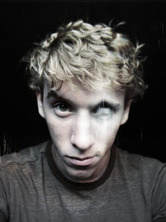
Raster self portrait Brandon Beren -

Straight self portrait (photo)

Process:
First, I copied the background to get an unlocked version of the original photo to work with. I wanted to go with a darker, little more morbid feel, so I first made a hue adjustment layer to bring down the saturation, checked colorize with a blue hue, and lowered the opacity.

I wanted to make it bluer around y left eye so I raised the opacity of the layer slightly and filled the entire mask with a mid-high gray shade and took a white brush to totally reveal the blue hue around the eye.

Next, I made another copy of the original photo and applied a Gaussian blur to the layer. I applied a layer ask completely full of white to reveal the layer and filled most of the face closer to the camera with white to hide the blurred part of the image to give it a macro look and feel.

Going on, I too the blurred layer and copied it as another layer, further blurred it and went into the liquefy tool to warp it around the eye. I then made a curves adjustment layer clipped to this layer to over expose it. I then painted over the eye in the layer mask of the blurred layer to only reveal certain parts of the image I wanted.

For the vignette high contrast look, I simply made a new layer, used a radial black and white gradient and set it to color burn at 44% opacity.

Last but not least... For the old photo scratches... I made a new layer, filled it with white, rendered using the fibers filter with low variance and high strength, made a selection of the black fibers with the magic wand, saved it as a layer mask, saved the layer mask in the channels palette, hid the selection, and hand painted with a brush in parts of the imaged over the eye mostly and randomly other places to give visual interest.

That's it. The reason I made the portrait like this is because I recently, before the semester, went blind in m left eye. Its mostly better now, but I'm stuck with 20/70 vision for the rest of my life in the eye... Better then worst than 20/200 though.

Tuesday, January 25, 2011

picon_rasterexer


When it comes to my work I am trying to change perceptions on what the viewer already considers to be “normal” or “actual”. Not necessarily wanting to change beliefs but mainly rearranging what we take for granted around us and presenting them in an exaggerated or obvious way that grabs our attention. This picture was taken with cardboard cutouts and me standing further away from the camera to make it proportional.

Tuesday, January 18, 2011

Health and Saftey Module

It is now required that all 100 level classes pass a Health and Safety Module. To begin, you must enroll in the Blackboard 9 website. A “task” will be sent to your myasu account, follow the prompts to self enroll; proceed with watching the video and taking the related quiz. You must pass with an 80% to receive credit. You must repeat the test in additional CORE classes until you receive a 100%. When you achieve a 100% you will be exempt for taking the quiz again and instructed on how to take a screen
capture to maintain a record of your accomplishment. Please note that this in an introduction to safety at ASU and other training sessions will be required in upper division classes as necessary for the studio you will be working in under faculty supervision. So, even though some of the material covered in this module may not seem immediately important it WILL become important as you matriculate though your BFA program.

Instructions:
1. Students must enroll in BB9
2. From the Bb homepage, click the COURSES tab
2
3. Type "SOA" into the Course Search box on the upper left

4. The Health and Safety module is ~3rd from top. Click the Course ID link.
5. Immediately, they're asked if they want to enroll in this course. 

6. Bingo. Self-enrollment done. Proceed with task.
7. To take a screen capture hold apple+shift+3, listen for the shutter sound. (This takes a picture of the screen, a .png file, and places it on your desktop. You may print this and prove to me that got 100%. Be sure to take snapshot before you close the score page, as you will not be able to access it again)

ASU Safety Procedures (take responsibility for your health and safety!)
http://www.asu.edu/cfa/wwwcourses/art/SOACore/safety.htm

Due date: Jan 26