 I chose to recreate a book called Left Brain, Right Brain by Sally Springer and Georg Deutsch. From prior knowledge I tried to portray my idea of what the difference between the two are. The left brain is the more organizational, mathematical side of the brain while the right brain is artistic and spontaneous.

Monday, March 7, 2011
Ben Sheets Vector Project
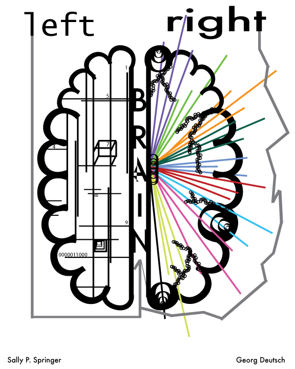
I chose to recreate a book called Left Brain, Right Brain by Sally Springer and Georg Deutsch. From prior knowledge I tried to portray my idea of what the difference between the two are. The left brain is the more organizational, mathematical side of the brain while the right brain is artistic and spontaneous.
Alyssa Bouck Vector Project
 I chose the book Th1rteen R3asons Why for my project because I felt like I could get the most out of making a cover. I chose a cassette tape because the book is about a girl who commits suicide, but makes a tape beforehand giving the 13 reasons why, including 13 different people. I chose to outline the text in red because I was thinking of the suicide.
Ryan Evans Vector Project

I made a cover for the book Pseudo City by D. Harlon Wilson. I chose this book because it is one of my favorite books of all time. For the figure in the cover I made him intentionally flat and minimalistic using the pen tool. I found the background for the figure and chose to keep the rest of the cover simple with black text on grey.
Heart of Darkness

Heart of Darkness by Joseph Conrad.
This is a book I enjoyed reading a few years back. It takes place in the Congo and explores the hypocrisy of imperialism, madness as a result of imperialism, and the absurdity of evil. The main character ventures up a river in the Congo to meet with Kurtz, the man on the cover, who was dressed in an all white suit in the middle of the Congo.
Sunday, March 6, 2011
Jim J vector project

Brandi Blanco Vector Project

For this project I choose to do the very hilarious book "5 Very Good Reasons to Punch a Dolphin in the Mouth" by the Oatmeal. The design is pretty basic with simple colors, everything but the text, and stars was made with the pencil and brush tool.
Saturday, March 5, 2011
Haleigh Klandrud Vector Project

This book isn't actually published, it happens to be a novel my older sister wrote and is currently working on editing/getting it published and I thought it would be fun to make a cover for it. The twisted rabbit ears are part of some of the characters in the book, and the overall look of the book cover is rather dark because the theme of the book itself is dark. The letters of "darkness" descend and fade away to show the movement of going down, since these twisted rabbit eared creatures live underground, and the main characters spend the majority of the book underground as well. I tried to make a "scary" book cover, but realized it was a lot harder than I had originally thought it would be so I ended up with this.
Wednesday, March 2, 2011
Haylee Schiavo

The Road, by Cormac McCarthy. For my project I wanted to achieve two things: simplicity juxtaposed with complexity. The design is simple, with silhouettes of a gun and two people. The color scheme is simple, but I think it is successful in the aesthetic appeal. The complexity is found in the meaning behind the imagery of the book cover. For example, the gun is a major symbol in the novel. It not only suggests murder and chaos, but it reaches a further meaning that is presented more so towards the end of the novel. The man and the son are the two main characters. They also represent a more important concept that is suggested in the novel that questions at what point it life lacks its purpose. In general each of the symbols on the cover represents this deeper meaning, and the color scheme represents the chaos in the novel in contrast with the simplicity of emotions that are arisen. The novel is simple and yet it is complex, just like the book cover. I did my best in presenting this message. Also, the lines, to create the road, lead your eye to the title, which gives the sense of an obstacle in which the two figures on the bottom are going to face in the novel. That is the main message I wanted to achieve.
Sanders Vector Project
 I chose one of my favorite books, The Sweet Far Thing by Libba Bray. All of the images on this leather diary cover are representative of events in the book. I chose them for this reason as well as their aesthetic effectiveness. I converted a raster picture of a tree to vector, and edited the outlines and shapes of it. I made the background out of a leather book cover raster image, and chose a font with serif that had had the same sort of "feeling" in its lines as the tree.
Matt Picon Vector Project

I chose the book "Survivor" by Chuck Palahniuk. There are very apparent religious connotations within this novel and while most of the story is told as a memory, the setting is on a falling plane. In this design I wanted to incorporate both of these elements into my book cover, which took 3 separate images to create. I am attracted towards negative space and simple designs on books, which explains my black and white colors and stencil quality I used with the image. Several different fonts were used to create the text which I wanted to keep rigid and formal, contrasting the simple dynamic of the image.
Jared Wicklund

For this project I was trying to make a very simple type of book cover, similar to the ones show before. Very much like the original book cover, it has a very simple design, but conveys the point of it being very like a "how to" book. For this, I used the tracing tool, and it took some difficulty changing the color for one of the symbols to appear zombie-like.
Matt Fahnestock Vector Project

This is a cover for the book 1984 by George Orwell. I wanted to convey the feeling of always being watched, which the main character always feels.
Subscribe to:
Comments (Atom)