 I used trace to create the image of the dancer. I used this book cover because I wanted to get creative with Mambo dancing. Unfortunately, my limited knowledge in Illustrator left me with this simple design.

Thursday, September 30, 2010
Claudia Jara - Vector Project
I used trace to create the image of the dancer. I used this book cover because I wanted to get creative with Mambo dancing. Unfortunately, my limited knowledge in Illustrator left me with this simple design.
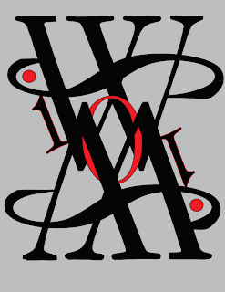
Nick Santoro- Vector Project


Tim Nelson Vector Project
 One of the most popular words or ideals associated with the United States of America is Freedom. That's where this idea for my book cover derived from. I checked the best sellers list on Barnes and Noble and found a book called Freedom by Jonathan Franzen. I'm more of a photographer than a graphic designer so I mostly used raster based images to create this cover.
LELYND VECTOR PROJECT
 No Exit is a book based off of a 1944 existentialist french play by Jean-Paul Sartre. The book explains how HELL is other people. When three people get locked in a room with no windows, no mirrors, and only a door they are left with only each other. I wanted to show the intensity of the book through the cover. I also wanted the viewer to have a feel for the genre and the book's existentialism.
Kelsey Meyer, VeCtoR ProJect

For my book cover I wanted to give it a Shepherd Farley look. I used the rising sun idea with one of his prints as the rays. I used multiple layers to build my project and to give it that paper feel and look I found and image of an old piece of paper and just placed it over the background with the opacity turned down. I wanted the reader read the title first so I made it pop by not covering it with the paper layer and placing it on the black. I played with the title by flipped or folding the last two words. I choose the Bauhaus 93 font because I felt it gave the composition that design or industrial feel I was looking for.
Vector Project - Morgan Sweazy

Kyle Parsons_Vector Project
 For this project, I did my favorite novel as a kid. I felt that the cover should show the most exciting part of the book to spark interest.
Thursday, September 23, 2010
Vector Project
Project: Design A Book Cover
Technical: To gain a basic understanding of vector based digital imaging software (Illustrator) and using raster images within it.
Conceptual: To explore how images and text generate a range of ideas and emotions, and to better understand how design and text can be utilized to market and advertise particular products.
Materials: Digital camera (with necessary cables), web images, and a computer with
Adobe Illustrator and Photoshop.
Process:
Brainstorm and submit proposals for 5 possible books and the accompanying designs.
Launch Illustrator and create a new document (FILE >> NEW) that is 10 in. high and 8 in wide.
3. Find images that you will use in your theme. Make necessary preparations in photoshop.
4. Drag images from photoshop into Illustrator. Begin layout of text and images in Illustrator using layers.
5. Using the application’s tools, combine your individual parts into one final piece.
6. When satisfied, save it as an Adobe Illustrator (Ai) file in the VECTOR PROJECT FOLDER. Save it as: lastname_vectorproj.ai Then save out a GIF copy of your composition :
A. File >> Save for Web and Devices.
B. For file type, select GIF from the dropdown menu.
C. Uncheck the box next to “Transparency.”
D. Under the “Image Size” tab, check “Clip to Artboard” and hit “Apply.”
E. Click “Save.”
7. Upload your gif file to the class’ blog. Write a brief explanation.
8. Label post "vector project" and title post with your name.
Tuesday, September 21, 2010
Nick Santoro vector excercise

Vector Exercise- Jordan

For this image, I chose to go in a different direction than the first. I messed with the letter 'L' by layering it and creating a more unorganized picture. I also chose colors that would allow the letters to stand out. I worked a lot with the angles of the images (horizontal, vertical, diagonal)
Courtney Tovar - Vector Exercise
 I didn't really know what to do with these letters... or for this exercise at all, actually. So I just decided to mess around with them until I thought it looked kinda cool.
The whole picture is basically the letter "O" and some other symbols, such as brackets and different punctuation... I added a little color to make some things pop. It's really simple... Very alien/robot-ish. :]
Kelsey Meyer, vector exercise

For my composition I didn't Know what to do for and abstract piece so I just took a letter that I found pleasing to the eye, the letter Q, and played with the rule of thirds. Trying to get the tips of the tail to be a different color was probably the hardest part, but I figured out the scissor tool and pieced my composition together. I used the colors black, white and red because I found them appealing and it seems to be common in abstract art.
Kyle Parsons_Vector Exercise
 For the vector exercise, I chose to do something psychedelic and interesting to the eyes.
Taylor Phillips Vector Exercise

I just took a bunch of arial letters and tried to put them together in an interesting form using only black and white.
Tara Grey- Raster Exercize
 For this assignment, I used the font Papyrus. I played off concepts of contrast, with black and white, circles and straight lines. Also, I personally find abstract art more striking and aesthetically pleasing when its a more simple design.
Tim Nelson Vector Exercise
 First of all, this entire idea started out when I came into class early and had plenty of time to kill. So I started playing around with the Letter F. I started rearranging it on my artboard is multiple ways. Upside down, right side up, backward, etc... Then I got the idea of turning it diagonally and that's when the ideas in my head started going off and with some suggestions from Professor Shipley, I created this. A structure or pillar of "F's" that just comes crashing down and turning into chaos or anarchy.
Vector Exercise - Morgan Sweazy

Sam's Vector Exercise

So this is my piece. I just took all of the letters in Matura MT Script Capitals and spread them out. I played around with size of the letters and the opacity to create a layered look.
Thursday, September 16, 2010
Vector Exercise
UNIT2: VECTOR EXERCISE
_ _ _ _ _ _ _ _ _ _ _ _ _ _ _ _ _ _ _ _ _ _ _ _ _ _ _ _
Exercise: LETTERFORM COMPOSITION.TOTAL POINTS: 100
_ _ _ _ _ _ _ _ _ _ _ _ _ _ _ _ _ _ _ _ _ _ _ _ _ _ _ _
OBJECTIVES
Technical: To learn the basics of vector-based software (Adobe Illustrator).
Conceptual: To explore the use of type as abstract shape, and to investigate how
framing creates and defines positive and negative space.
_ _ _ _ _ _ _ _ _ _ _ _ _ _ _ _ _ _ _ _ _ _ _ _ _ _ _ _
Overview: You’re challenge is to create a dynamic, abstract composition that incorporates deliberate use of positive / negative space using only simple letterforms (type).
_ _ _ _ _ _ _ _ _ _ _ _ _ _ _ _ _ _ _ _ _ _ _ _ _ _ _ _
Materials: Computer and vector-based software (Adobe Illustrator).
_ _ _ _ _ _ _ _ _ _ _ _ _ _ _ _ _ _ _ _ _ _ _ _ _ _ _ _
Process:
1. Launch Illustrator and create a new document (FILE >> NEW) that is 10 in. x 10 in.
2. Using the Type Tool, explore the different type faces (fonts) available, looking
specifically for font/letter combinations with interesting shapes, curves, lines, etc.
3. Once you’ve chosen the letter(s) you want to work with, convert it to outlines by
selecting it with the Selection Tool (solid arrow), and by choosing “Create Outlines”
under the “Type” menu.
4. Using your 10 x 10 inch document boundary as a frame, experiment with different
framing solutions by altering the letter’s scale, rotation, and placement. Pay special
attention to the positive / negative relationship that your framing choices create.
Also consider what reversing the colors of your positive / negative space will do to
the composition (white on black or black on white).
6. When you feel like your composition is coming together, solidify your design by
creating a clipping mask.
A. Use the Rectangle Tool to draw a square the same size as your document.
B. Select everything by choosing “Select All” under the “Select” menu (or command A).
C. Finally, choose “Clipping Mask >> Make” under the “Object” menu.
You can continue to modify your composition’s scale, rotation, and placement even
after the clipping mask has been made.
7. When satisfied, save it as an Adobe Illustrator (Ai) file in the VECTOR EXERCISE FOLDER. Save it as: lastname_vectorexer.ai Then save out a GIF copy of your composition :
A. File >> Save for Web and Devices.
B. For file type, select GIF from the dropdown menu.
C. Uncheck the box next to “Transparency.”
D. Under the “Image Size” tab, check “Clip to Artboard” and hit “Apply.”
E. Click “Save.”
F. Upload your gif file to the class’ blog. Write a brief explanation.
G. Label post "vector exercise" and title post with your name.
_ _ _ _ _ _ _ _ _ _ _ _ _ _ _ _ _ _ _ _ _ _ _ _ _ _ _ _
Exercise: LETTERFORM COMPOSITION.TOTAL POINTS: 100
_ _ _ _ _ _ _ _ _ _ _ _ _ _ _ _ _ _ _ _ _ _ _ _ _ _ _ _
OBJECTIVES
Technical: To learn the basics of vector-based software (Adobe Illustrator).
Conceptual: To explore the use of type as abstract shape, and to investigate how
framing creates and defines positive and negative space.
_ _ _ _ _ _ _ _ _ _ _ _ _ _ _ _ _ _ _ _ _ _ _ _ _ _ _ _
Overview: You’re challenge is to create a dynamic, abstract composition that incorporates deliberate use of positive / negative space using only simple letterforms (type).
_ _ _ _ _ _ _ _ _ _ _ _ _ _ _ _ _ _ _ _ _ _ _ _ _ _ _ _
Materials: Computer and vector-based software (Adobe Illustrator).
_ _ _ _ _ _ _ _ _ _ _ _ _ _ _ _ _ _ _ _ _ _ _ _ _ _ _ _
Process:
1. Launch Illustrator and create a new document (FILE >> NEW) that is 10 in. x 10 in.
2. Using the Type Tool, explore the different type faces (fonts) available, looking
specifically for font/letter combinations with interesting shapes, curves, lines, etc.
3. Once you’ve chosen the letter(s) you want to work with, convert it to outlines by
selecting it with the Selection Tool (solid arrow), and by choosing “Create Outlines”
under the “Type” menu.
4. Using your 10 x 10 inch document boundary as a frame, experiment with different
framing solutions by altering the letter’s scale, rotation, and placement. Pay special
attention to the positive / negative relationship that your framing choices create.
Also consider what reversing the colors of your positive / negative space will do to
the composition (white on black or black on white).
6. When you feel like your composition is coming together, solidify your design by
creating a clipping mask.
A. Use the Rectangle Tool to draw a square the same size as your document.
B. Select everything by choosing “Select All” under the “Select” menu (or command A).
C. Finally, choose “Clipping Mask >> Make” under the “Object” menu.
You can continue to modify your composition’s scale, rotation, and placement even
after the clipping mask has been made.
7. When satisfied, save it as an Adobe Illustrator (Ai) file in the VECTOR EXERCISE FOLDER. Save it as: lastname_vectorexer.ai Then save out a GIF copy of your composition :
A. File >> Save for Web and Devices.
B. For file type, select GIF from the dropdown menu.
C. Uncheck the box next to “Transparency.”
D. Under the “Image Size” tab, check “Clip to Artboard” and hit “Apply.”
E. Click “Save.”
F. Upload your gif file to the class’ blog. Write a brief explanation.
G. Label post "vector exercise" and title post with your name.
Tuesday, September 14, 2010
Raster Project - Morgan Sweazy

This is the laundry room at my dorm. I took pictures in the morning, afternoon and evening to show all the different colors of light coming into the room. I tried to show that even though the changed are slight, the laundry room does differ throughout the day, mainly with colors. Whenever I went in, there were clothes that were left behind, which also marks change. I only saw that one girl in the laundry room, but the clothes on the other machines and on the floor hint that people are always coming and going. Also, I tried to show how long the laundry room is by adding a fish-eye type look to the picture as a whole, and I added drop-shadow to each of the photos.


Tara Grey Raster Exercize

For this image, it was my attempt to capture the motion of my boyfriend as he was skateboarding. Also to play with concepts of perspective, lighting, and paying attention to unlikely details which make the shot interesting.
Taylor Phillips Raster Exercise

For my project I shot at a park near my house. My primary goal was to show how the color and lighting of the scene changed over the course of a day. Secondarily, I wanted to show some of the people who passed through that area of the park during different times of he day.
Thursday, September 9, 2010
Skate Sequence....

For this project I used a motion camera to capture the whole shot. In Imovie I took screenshots of (about) every tenth of a second and put them together in photoshop. Using multiple layers and the technique of masking and blending, I made the 14 pics to look like one. It's hard to tell but the camera pans to the left slightly distorting the background but having trees in the background made it easy to hide.
Nelson Raster Exercise
 Man vs Nature... In my interpretation of Man vs Nature I choose to show more of the beginning of big cities. When we, as humans, begin to build cities we usually have to clear out the surrounding obstacles which for the most part are trees. Although we are destroying the surrounding beauty, we are creating something that is just as important and good for the survival of our civilization.
Thursday, September 2, 2010
Raster Project
UNIT1: RASTER PROJECT. TOTAL POINTS: 150
_ _ _ _ _ _ _ _ _ _ _ _ _ _ _ _ _ _ _ _ _ _ _ _ _ _ _ _ _ _ _ _ _ _ _ _ _
TIME AND SPACE. DIGITAL PHOTOMONTAGE.
_ _ _ _ _ _ _ _ _ _ _ _ _ _ _ _ _ _ _ _ _ _ _ _ _ _ _ _ _ _ _ _ _ _ _ _ _
Due: September 14th at 1:40 PM, the beginning of class.
OBJECTIVES
Technical: To gain a basic understanding of raster based digital imaging software and the technology, terminology, and techniques associated with it.
Conceptual: To explore the concept of time and space using photomontage as a method of compressing time into one seemingly single moment.
_ _ _ _ _ _ _ _ _ _ _ _ _ _ _ _ _ _ _ _ _ _ _ _ _ _ _ _ _ _ __ _ _ _ _ _
Overview: How many ways can you visually represent the same thing? How can using multiple photographs represent something better than only one? How does the passage of time change a scene? How much time must pass before you can measure change? Seconds? Minutes? Hours? Days?
For this project your challenge will be to use digital photomontage to create a portrait of a scene over a period of time and space. The subject and the span of time are up to you, it could be ten hours or two days. Think about ways using multiple photographs can better represent something. Try different angles, from the ground, from above, get close, get far away, be creative!
_ _ _ _ _ _ _ _ _ _ _ _ _ _ _ _ _ _ _ _ _ _ _ _ _ _ _ _ _ _ _ _ _ _ _ _ _
Materials: digital camera with necessary cables. Computer with Adobe Photoshop. A tripod and cable release for your camera may be helpful.
_ _ _ _ _ _ _ _ _ _ _ _ _ _ _ _ _ _ _ _ _ _ _ _ _ _ _ _ _ _ _ _ _ _ _ _ _
Process:
1. Choose a subject that will change greatly over time (Day, Night, Weekend). Pick one that is interesting or important for you. Create 5 proposals of subjects and be prepared to share them.
2. Go to your location, spend some time exploring it. Make some decisions about how you want your final piece to look.Is it best photographed from one single point of view or from many? Do you want your final piece clear and seamless or jagged and distorted? Do you need a tripod? If you are working with found images, try to find the exact spot from where the original photo was taken.
3. Shot shot shot, take lots of pictures. It’s always better to have to many images than not enough. Shoot from a single location or from many locations. All the while keeping in mind how your “pieces” will fit together. Bring a notebook and make a sketch of your scene as you photograph.
4. Let some time pass, hours, days, return to your subject and shoot some more. When you return to your location, what has changed? Has the way the location is used changed with time? Has the color and the direction of light changed? Seek out and emphasize the changes you find.
5. Transfer your images to your external hard drive at home, or bring your camera, memory card, and transfer cables to class with you. If you have a memory card reader for your camera bring it too.
6. Working in Adobe Photoshop, create a blank document that is approximately 11x14 inches (vertical or horizontal) at 300 dpi. Use the RGB color mode and a bit depth of 8. FILE >>SAVE your new document to your external media storage device. You must work off of your own storage media (not the desktop of the lab computers).SAVE your work often!
7. Using layers, adjustment layers, and layer masks, combine your parts into one final piece. Depending on how well you photographed your scene, you may need to rotate or distort your individual photo to make things “fit”. In some cases things may never correctly “fit”. Remember you are not really constructing reality, but your interpretation of that reality.
8. When complete, drop your full resolution layered PSD file into the class folder, and keep it for your records in your own external storage. Name it like this: lastname_rasterproj.psd (the psd extension will be automatically added when you save the file in that particular format, you don’t have to type it).
9. Then size your image down to 800 pixels (in the widest direction) at 72 dpi (IMAGE>>IMAGE SIZE>> or use the crop tool). Use FILE>>SAVE FOR WEB AND DEVICES to save a copy of your image as jpeg. Name your exported file as: lastname_rasterexer.jpg.
10. Upload your resized file (jpeg) to the class blog. Write a paragraph explaining your piece.
_ _ _ _ _ _ _ _ _ _ _ _ _ _ _ _ _ _ _ _ _ _ _ _ _ _ _ _ _ _ _ _ _ _ _ _ _
TIME AND SPACE. DIGITAL PHOTOMONTAGE.
_ _ _ _ _ _ _ _ _ _ _ _ _ _ _ _ _ _ _ _ _ _ _ _ _ _ _ _ _ _ _ _ _ _ _ _ _
Due: September 14th at 1:40 PM, the beginning of class.
OBJECTIVES
Technical: To gain a basic understanding of raster based digital imaging software and the technology, terminology, and techniques associated with it.
Conceptual: To explore the concept of time and space using photomontage as a method of compressing time into one seemingly single moment.
_ _ _ _ _ _ _ _ _ _ _ _ _ _ _ _ _ _ _ _ _ _ _ _ _ _ _ _ _ _ __ _ _ _ _ _
Overview: How many ways can you visually represent the same thing? How can using multiple photographs represent something better than only one? How does the passage of time change a scene? How much time must pass before you can measure change? Seconds? Minutes? Hours? Days?
For this project your challenge will be to use digital photomontage to create a portrait of a scene over a period of time and space. The subject and the span of time are up to you, it could be ten hours or two days. Think about ways using multiple photographs can better represent something. Try different angles, from the ground, from above, get close, get far away, be creative!
_ _ _ _ _ _ _ _ _ _ _ _ _ _ _ _ _ _ _ _ _ _ _ _ _ _ _ _ _ _ _ _ _ _ _ _ _
Materials: digital camera with necessary cables. Computer with Adobe Photoshop. A tripod and cable release for your camera may be helpful.
_ _ _ _ _ _ _ _ _ _ _ _ _ _ _ _ _ _ _ _ _ _ _ _ _ _ _ _ _ _ _ _ _ _ _ _ _
Process:
1. Choose a subject that will change greatly over time (Day, Night, Weekend). Pick one that is interesting or important for you. Create 5 proposals of subjects and be prepared to share them.
2. Go to your location, spend some time exploring it. Make some decisions about how you want your final piece to look.Is it best photographed from one single point of view or from many? Do you want your final piece clear and seamless or jagged and distorted? Do you need a tripod? If you are working with found images, try to find the exact spot from where the original photo was taken.
3. Shot shot shot, take lots of pictures. It’s always better to have to many images than not enough. Shoot from a single location or from many locations. All the while keeping in mind how your “pieces” will fit together. Bring a notebook and make a sketch of your scene as you photograph.
4. Let some time pass, hours, days, return to your subject and shoot some more. When you return to your location, what has changed? Has the way the location is used changed with time? Has the color and the direction of light changed? Seek out and emphasize the changes you find.
5. Transfer your images to your external hard drive at home, or bring your camera, memory card, and transfer cables to class with you. If you have a memory card reader for your camera bring it too.
6. Working in Adobe Photoshop, create a blank document that is approximately 11x14 inches (vertical or horizontal) at 300 dpi. Use the RGB color mode and a bit depth of 8. FILE >>SAVE your new document to your external media storage device. You must work off of your own storage media (not the desktop of the lab computers).SAVE your work often!
7. Using layers, adjustment layers, and layer masks, combine your parts into one final piece. Depending on how well you photographed your scene, you may need to rotate or distort your individual photo to make things “fit”. In some cases things may never correctly “fit”. Remember you are not really constructing reality, but your interpretation of that reality.
8. When complete, drop your full resolution layered PSD file into the class folder, and keep it for your records in your own external storage. Name it like this: lastname_rasterproj.psd (the psd extension will be automatically added when you save the file in that particular format, you don’t have to type it).
9. Then size your image down to 800 pixels (in the widest direction) at 72 dpi (IMAGE>>IMAGE SIZE>> or use the crop tool). Use FILE>>SAVE FOR WEB AND DEVICES to save a copy of your image as jpeg. Name your exported file as: lastname_rasterexer.jpg.
10. Upload your resized file (jpeg) to the class blog. Write a paragraph explaining your piece.
Subscribe to:
Comments (Atom)